Table-Only View
Table-Only View
ALP provides the following table types:
-
Analytical (sap.ui.table)
-
Grid
-
Responsive (sap.m.table)
tableType setting in the descriptor file to select any
of the table types mentioned above.Use the analytical table type with entity sets
containing sap:semantics as aggregates.
This image is interactive. Hover over each area for a description. Click highlighted areas for more information
Hover over each action for a description. Click the action for more information.
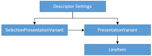
Descriptor Settings: Table-only view
Configuration Sample:
"sap.ui.generic.app":{
   "pages":[
      {
         "entitySet":"SEPMRA_C_ALP_SlsOrdItemCube",
         "component":{
            "name":"sap.suite.ui.generic.template.AnalyticalListPage",
            "list":true,
            "settings":{
                  "qualifier":"DefaultVariant",
                  }
            }
      }
},
Annotation: SelectionPresentationVariant with Qualifier="DefaultVariant"
Configuration Sample:
<Annotation Term="UI.SelectionPresentationVariant" Qualifier="DefaultVariant">
  <Record>
    <PropertyValue Property="Text" String="Product Financial Analysis"/>
    <PropertyValue Property="SelectionVariant" Path="@UI.SelectionVariant#DefaultSelectionVariant"/>
    <PropertyValue Property="PresentationVariant" Path="@UI.PresentationVariant#DefaultPresentationVariant"/>
  </Record>
</Annotation>
Annotation: Presentation Variant
<Annotation Term="UI.PresentationVariant" Qualifier="DefaultPresentationVariant">
  <Record>
    <PropertyValue Property="Text" String="Default"/>
    <PropertyValue Property="SortOrder">
      <Collection>
        <Record Type="Common.SortOrderType">
          <PropertyValue Property="Property" PropertyPath="NetAmount"/>
          <PropertyValue Property="Descending" Bool="true"/>
        </Record>
      </Collection>
    </PropertyValue>
    <PropertyValue Property="Visualizations">
      <Collection>
         <AnnotationPath>@UI.LineItem#Default</AnnotationPath>
      </Collection>
   </PropertyValue>
  </Record>
</Annotation>Presentation Variant annotation example
Annotation: LineItem
<Annotation Term="UI.LineItem" Qualifier="Default">
  <Collection>
    <Record Type="UI.DataField">
      <PropertyValue Property="Value" Path="DeliveryCalendarYear"/>
        <Annotation Term="UI.Importance" EnumMember="UI.ImportanceType/High"/>
    </Record>
    <Record Type="UI.DataField">
      <PropertyValue Property="Value" Path="DeliveryCalendarMonth"/>
        <Annotation Term="UI.Importance" EnumMember="UI.ImportanceType/High"/>
    </Record>
    <Record Type="UI.DataField">
      <PropertyValue Property="Value" Path="SalesOrder"/>
        <Annotation Term="UI.Importance" EnumMember="UI.ImportanceType/High"/>
    </Record>
    <Record Type="UI.DataFieldForIntentBasedNavigation">
      <PropertyValue Property="Label" String="Manage Sales Order"/>
      <PropertyValue Property="SemanticObject" String="EPMSalesOrder"/>
      <PropertyValue Property="Action" String="manage_st"/>
      <PropertyValue Property="RequiresContext" Bool="false"/>
        <Annotation Term="UI.Importance" EnumMember="UI.ImportanceType/High"/>
    </Record>
    <Record Type="UI.DataFieldWithIntentBasedNavigation">
      <PropertyValue Property="SemanticObject" String="EPMSalesOrder"/>
      <PropertyValue Property="Action" String="manage_st"/>
      <PropertyValue Property="Value" Path="SalesOrder"/>
      <Annotation Term="UI.Importance" EnumMember="UI.ImportanceType/High"/>
    </Record>
    <Record Type="UI.DataField">
      <PropertyValue Property="Label" String="Item"/>
      <PropertyValue Property="Value" Path="SalesOrderItem"/>
      <Annotation Term="UI.Importance" EnumMember="UI.ImportanceType/High"/>
    </Record>
    <Record Type="UI.DataField">
      <PropertyValue Property="Value" Path="Product"/>
      <Annotation Term="UI.Importance" EnumMember="UI.ImportanceType/High"/>
    </Record>
    <Record Type="UI.DataFieldWithIntentBasedNavigation">
      <PropertyValue Property="SemanticObject" String="EPMProduct"/>
      <PropertyValue Property="Action" String="manage_st"/>
      <PropertyValue Property="Value" Path="Product"/>
      <Annotation Term="UI.Importance" EnumMember="UI.ImportanceType/High"/>
    </Record>
    <Record Type="UI.DataField">
      <PropertyValue Property="Value" Path="ProductName"/>
      <Annotation Term="UI.Importance" EnumMember="UI.ImportanceType/High"/>
    </Record>
    <Record Type="UI.DataField">
      <PropertyValue Property="Value" Path="MainProductCategory"/>
      <Annotation Term="UI.Importance" EnumMember="UI.ImportanceType/High"/>
    </Record>
    <Record Type="UI.DataField">
      <PropertyValue Property="Label" String="Customer"/>
      <PropertyValue Property="Value" Path="SoldToPartyCompanyName"/>
      <Annotation Term="UI.Importance" EnumMember="UI.ImportanceType/High"/>
    </Record>
    <Record Type="UI.DataField">
      <PropertyValue Property="Value" Path="Quantity"/>
      <Annotation Term="UI.Importance" EnumMember="UI.ImportanceType/High"/>
    </Record>
    <Record Type="UI.DataField">
      <PropertyValue Property="Value" Path="NetAmount"/>
      <Annotation Term="UI.Importance" EnumMember="UI.ImportanceType/High"/>
    </Record>
</Collection>
</Annotation>
The data set helps ALP decide which table to display when it is not configured in descriptor settings. If the data set
- Comes from an analytical OData service, then ALP renders data through an analytical table. This table provides grouping and aggregation of data at different levels.
- Doesn't come from an analytical OData service and grid table usage is enabled in your
descriptor setting (
tabletype=GridTablePresentation V), then ALP brings up the grid table (sap.ui.table) for the tabular display.
By default, ALP displays tables in condensed mode. You can modify the descriptor setting to use compact mode.
You can perform several table level operations using the table toolbar. The settings feature allows you to
- Add or remove dimensions and measures bound to a table
- Perform sort operations on a table
- Choose dimensions to group a table as needed
You can adjust the width of columns by modifying the MaxLength metadata
for texts strings and Precision metadata for decimals.
Configure the descriptor file to provide table navigation. Choose Details to navigate from a table row to another application.
The selected table record context is passed to the target application as a navigation context. In case of:
-
Inner app navigation: The selected table record context is passed to the target application
-
External navigation: The selected table record and filter context is passed to the target application
-
To remove values from the selection variant passed in the navigation context, use the
adaptNavigationParameterExtensionbreakout.
"sap.ui.generic.app": {
	"_version": "1.3.0",
	"pages": {
“page-1”: {
			“entitySet”: ….
			“component": {
				…
				…
			} // End of component
"pages": [{ //ALP does an inner app navigation to the smart template specified below
				"entitySet": "<<ZCOSTCENTERCOSTSQUERY0020>>", //Ensure that the Entity set specified here is the same entity set used in the main content area.
				"component": {
					"name": "<<sap.suite.ui.generic.template.ObjectPage>>"
				}
"navigation": { //Optional (If specified ALP navigates to the target Application specified below through external app navigation)
                "display": {
                               "path": "sap.app.crossNavigation.outbounds",
                               "target": "<<NavigateToCTRItem>>"
                           }
              }

			}]
		} // End of page-1
}
}
Filter Option
You can enable filtering in the smart table area by configuring the
enableTableFilterInPageVariant setting in the descriptor file. By
default, filtering is:
-
Disabled in the page-level variant.
-
Enabled in the control-level variant and cannot be disabled.
In SmartTable, you can view the filter option after selecting the column header or from the personalization settings. Whereas, in responsive tables, the filter option is available only from table personalization settings.
"settings": {
              "qualifier": "MainContent",
              "defaultContentView": "charttable",
              "smartVariantManagement": true,
              "showGoButtonOnFilterBar": true,
              "multiSelect": true,
              "enableTableFilterInPageVariant":true,

              "tableType": "AnalyticalTable",
              ....
}
Custom Navigation
The DataFieldWithIntentBasedNavigation record type within the
LineItem annotation lets you include a navigation option in the smart
table. Defining this annotation adds a new column to the table and provides a link to the
target application based on the properties (semantic object and semantic action) configured
in the annotation.
Annotation sample
<Annotation Term="UI.LineItem" Qualifier="ActualCosts">
    <Collection>
        <Record Type="UI.DataFieldWithIntentBasedNavigation">
            <PropertyValue Property="Label" String="Cost Center (IBN)"/>
            <PropertyValue Property="Value" Path="CostCenter" />
            <PropertyValue Property="SemanticObject" String="alpwp"/>
            <PropertyValue Property="Action" String="display"/>
        </Record>
    </Collection>
</Annotation>
The DataFieldWithIntentBasedNavigation record type within the
LineItem annotation lets you include a navigation option within the smart
table
toolbar.
<Record Type="UI.DataFieldForIntentBasedNavigation">
<PropertyValue Property="Label" String="Manage"/>
<PropertyValue Property="SemanticObject" String="CompanyCode"/>
<PropertyValue Property="Action" String="display"/>
<PropertyValue Property="Inline" Bool="true"/>

</Record>
The selection column in the table is disabled if all of the following conditions are met:
-
There are no
DataFieldForActionbuttons defined by the application. -
There are no
DataFieldForIntentBasedNavigationbuttons withRequiresContextset to true. -
There are no manifest based custom actions with
RequiresSelectionset to true.
Actions by Annotation
Define custom action
buttons on the table toolbar using the DataFieldForAction property
associated to LineItem annotation.
To correctly integrate your app extension coding with SAP Fiori elements, use only the extensionAPI of SAP Fiori elements. For more information, see Using the extensionAPI.
Inline Button
Include a custom buttons in a table by defining the inline property in the
DataFieldForAction annotation. This button appears in the table column
and the position of the column depends on its position in the LineItem
annotation.
<Record Type="UI.DataFieldForIntentBasedNavigation">
<PropertyValue Property="Label" String="Manage"/>
<PropertyValue Property="SemanticObject" String="CompanyCode"/>
<PropertyValue Property="Action" String="display"/>
<PropertyValue Property="Inline" Bool="true"/>

</Record>
Determining Button
At the click of a button, the associated:
-
DataFieldForActionannotation handles the action as defined. The user application must ensure that this points to the fully qualified action or function. -
DataFieldForIntentBasedNavigationannotation launches the SAP Fiori applications as specified in the action. If the action is configured to accept context, then the selected table and filter context is passed to the target application through the navigation context.
You can configure the table toolbar to contain buttons defined with the annotations
com.sap.vocabularies.UI.v1.DataFieldForAction and
com.sap.vocabularies.UI.v1.DataFieldForIntentBasedNavigation. The determining
buttons for tables are in the footer bar, and chart buttons appear before determining
buttons.
<PropertyValue Property="Actions">
   <Collection>
      <Record Type="UI.DataFieldForAction">
         <PropertyValue Property="Label" String="Copy"/>
         <PropertyValue Property="Action" String="CZ_EASILINEITEMS_SADL_CDS.CZ_EASILINEITEMS_SADLType/Copy"/>
         <PropertyValue Property="InvocationGrouping" EnumMember="UI.OperationGroupingType/Isolated"/>
         <PropertyValue Property="Determining" Bool="true"/>

      </Record>
      <Record Type="UI.DataFieldForIntentBasedNavigation">
         <PropertyValue Property="Label" String="Manage Products (STTA)"/>
         <PropertyValue Property="SemanticObject" String="EPMProduct"/>
         <PropertyValue Property="Action" String="manage_st"/>
         <PropertyValue Property="Determining" Bool="true"/>
      </Record>
   </Collection>
</PropertyValue>
<PropertyValue Property="Actions">
   <Collection>
      <Record Type="UI.DataFieldForAction">
         <PropertyValue Property="Label" String="Copy"/>
         <PropertyValue Property="Action" String="CZ_EASILINEITEMS_SADL_CDS.CZ_EASILINEITEMS_SADLType/Copy"/>
      </Record>
      <Record Type="UI.DataFieldForIntentBasedNavigation">
         <PropertyValue Property="Label" String="Manage Products (STTA)"/>
         <PropertyValue Property="SemanticObject" String="EPMProduct"/>
         <PropertyValue Property="Action" String="manage_st"/>
         <PropertyValue Property="RequiresContext" />
      </Record>
   </Collection>
</PropertyValue>
Quick View in Table
You can configure the smart table column cells to display additional information in a quick view card. For more information, see Enabling Quick Views for Smart Link Navigation
Semantic Highlighting of Rows
Use a property or a dimension that represents the criticality of the record (row) in the
back end to add record-level semantic coloring in the SmartTable.
To enable this feature, add the criticalityProperty to the
LineItem annotation of the smartTable.
<Annotation Term="UI.LineItem">
  <Annotation Term="UI.Criticality" Path="Element_transporting_criticality_of_complete_LineItem" />         //LineItem Criticality annotation
  <Collection>
    <Record Type="UI.DataField">
      ...
    </Record>
  </Collection>
</Annotation>
The coloring of the criticality is defined as follows:
-
0 - None (No Color) - v1.CriticalityType/Neutral
-
1 - Error (Semantic Negative) - v1.CriticalityType/Negative
-
2 - Warning (Semantic Critical) - v1.CriticalityType/Critical
-
3 - Success (Semantic Positive) - v1.CriticalityType/Positive
The semantic coloring of table rows is supported for analytical tables, responsive tables, and grid tables.
For analytical tables, the field that returns the criticality must be a property and not a dimension.
Semantically Connected Fields
You can configure the table columns to view multiple field types. To enable this feature,
configure UI.LineItem, UI.DataFieldForAnnotation, and
UI.FieldGroup annotations as shown here:
LineItem annotation
<Annotation Term="UI.LineItem">
    <Collection>
        ………………………………
        ………………………………
        <Record Type="UI.DataFieldForAnnotation">
            <PropertyValue Property="Target" AnnotationPath="@UI.FieldGroup#ActionGroupTest" />
            <PropertyValue Property="Label" String="Multiple Actions"/>
        </Record>
        …………………
        …………………
    </Collection>
</Annotation>
FieldGroup Annotation
<Annotation Term="UI.FieldGroup" Qualifier="ActionGroupTest">
    <Record Type="UI.FieldGroupType">
        <PropertyValue Property="Data">
            <Collection>
                <Record Type="UI.DataFieldForAction">   // Can also be DataField or ImageURL or DataFieldForIntentBasedNavigation or DataFieldWithIntentBasedNavigation here
                    <PropertyValue Property="Action" String="ZEPM_C_SALESORDERITEMQUERY_CDS.ZEPM_C_SALESORDERITEMQUERYResult/update"/>
                    <PropertyValue Property="Label" String="Update Order"/>
                    <PropertyValue Property="Inline" Bool="true"/>
                </Record>
                <Record Type="UI.DataFieldForAction">
                    <PropertyValue Property="Action" String="ZEPM_C_SALESORDERITEMQUERY_CDS.ZEPM_C_SALESORDERITEMQUERYResult/delete"/>
                    <PropertyValue Property="Label" String="Delete Order"/>
                    <PropertyValue Property="Inline" Bool="true"/>
                </Record>
            </Collection>
    </Record>
</Annotation>
-
You can see fields belonging to the same
entityTypein the table personalization. -
Grid and analytical tables do not support semantically connected fields for the annotation properties
ImageURLandUI.Chart.