Step 6: Chart Container
Step 6: Chart Container
In the previous steps, we created a start page with embedded tiles. We prepared the routing configuration for navigation from the Quality Control tile to another view.
In the Quality Control view, we want to display the temperatures
needed for different flavors and the ideal temperature for getting the best ice cream
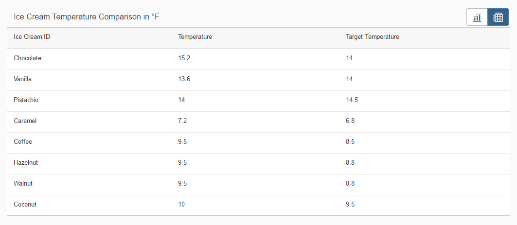
with a smooth consistency. We will use a chart to visualize the data and a table to get
a detailed view with the help of the ChartContainer control.
Preview
Chart Content
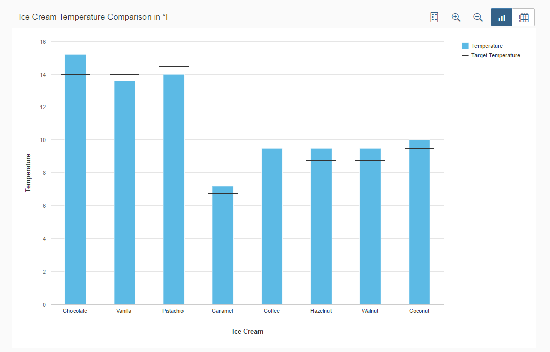
Table Content
ChartContainer
The ChartContainer control manages various data views in one
container. The single controls (for example, VizFrame and
Tables) are embedded in the
ChartContainerContent controls that were added to the
content aggregation of the
ChartContainer.
You can view and download this step in the Demo Kit at Ice Cream Machine - Step 6 - Chart Container.
ChartContainer.view.xml
mvc:View
    xmlns:mvc="sap.ui.core.mvc"
    xmlns:suite="sap.suite.ui.commons"
    xmlns:core="sap.ui.core"
    xmlns="sap.m"
    xmlns:l="sap.ui.layout"
    controllerName="sap.suite.ui.commons.demokit.tutorial.icecream.06.controller.ChartContainer">
    <Page
        title="{i18n>chartContainerPageTitle}"
        showNavButton="true"
        navButtonPress=".onNavButtonPressed"
        backgroundDesign="Solid">
        <content>
            <l:Grid defaultSpan="L12 M12 S12" class="sapUiResponsiveMargin" vSpacing="0" hSpacing="0">
               <suite:ChartContainer
                        title="{
                            parts: [
                                'i18n>chartContainerBulletChartTitle',
                                'business>/temperatureUnit'
                            ],
                            formatter: '.formatMessage'
                        }">
                    <suite:ChartContainerContent
                        icon="sap-icon://vertical-bullet-chart"
                        title="{i18n>chartContainerBulletChartContentTitle}">
                        <suite:content>
                            <core:Fragment
                                fragmentName="sap.suite.ui.commons.demokit.tutorial.icecream.06.fragment.VizChart"
                                type="JS" />
                        </suite:content>
                    </suite:ChartContainerContent>
                </suite:ChartContainer>
            </l:Grid>
        </content>
    </Page>
</mvc:View>
In the toolbar, there is a corresponding button for
each
ChartContainerContent
from which you can select the content. You
can
have an icon on the button if you set the
icon property of the
ChartContainerContent to the respective SAPUI5 icon URI. The
title property of the
ChartContainerContent determines the tooltip text for the
button.
Since VizFrame is not part of this tutorial, we have
provided the VizChart.fragment.js JavaScript file in the folder
fragment that can be used without modifications.
ChartContainer.controller.js
sap.ui.define([
     "sap/ui/core/mvc/Controller"
], function(Controller) {
    "use strict";

    return Controller.extend("sap.suite.ui.commons.demokit.tutorial.icecream.06.controller.ChartContainer", {
onNavButtonPressed: function() {
            var oRouter = this.getOwnerComponent().getRouter();
            oRouter.navTo("home");
        }
    });
});
In the ChartContainer.view.xml, we will add the backward
navigation with the showNavButton and
navButtonPress properties. The function that is referenced by
the navButtonPress event retrieves the router of the component and
navigates to the home route as specified in
manifest.json.
Table with details
In the next step, we are going to display detailed information about the data shown in the chart. We will be using a table in which each value is displayed, so that no information is lost.
ChartContainer.view.xml
mvc:View
    xmlns:mvc="sap.ui.core.mvc"
    xmlns:suite="sap.suite.ui.commons"
    xmlns:core="sap.ui.core"
    xmlns="sap.m"
    xmlns:l="sap.ui.layout"
    controllerName="sap.suite.ui.commons.demokit.tutorial.icecream.06.controller.ChartContainer">
    <Page
        title="{i18n>chartContainerPageTitle}"
        showNavButton="true"
        navButtonPress=".onNavButtonPressed"
        backgroundDesign="Solid">
        <content>
            <l:Grid defaultSpan="L12 M12 S12" class="sapUiResponsiveMargin" vSpacing="0" hSpacing="0">
                <suite:ChartContainer
                        title="{
                            parts: [
                                'i18n>chartContainerBulletChartTitle',
                                'business>/temperatureUnit'
                            ],
                            formatter: '.formatMessage'
                        }">
                    ...
                   <suite:ChartContainerContent
                        icon="sap-icon://table-chart"
                        title="{i18n>chartContainerTableContentTitle}">
                        <suite:content>
                            <Table items="{/Temperatures}">
                                <columns>
                                    <Column>
                                        <Text text="{i18n>chartContainerIceCreamId}" />
                                    </Column>
                                    <Column>
                                        <Text text="{i18n>chartContainerTemperature}" />
                                    </Column>
                                    <Column>
                                        <Text text="{i18n>chartContainerTargetTemperature}" />
                                    </Column>
                                </columns>
                                <items>
                                    <ColumnListItem>
                                        <cells>
                                            <Text text="{id}" />
                                            <Text text="{temperature}" />
                                            <Text text="{target}" />
                                        </cells>
                                    </ColumnListItem>
                                </items>
                            </Table>
                        </suite:content>
                    </suite:ChartContainerContent>
                </suite:ChartContainer>
            </l:Grid>
        </content>
    </Page>
</mvc:View>
We are going to create another ChartContainerContent with a
table. This table contains three columns that were created
with the Column element with a text that
will be shown in the header. The values were created with the
ColumnListItem that has a text control
with a bound text property for each cell.
Parent topic: Ice Cream Machine