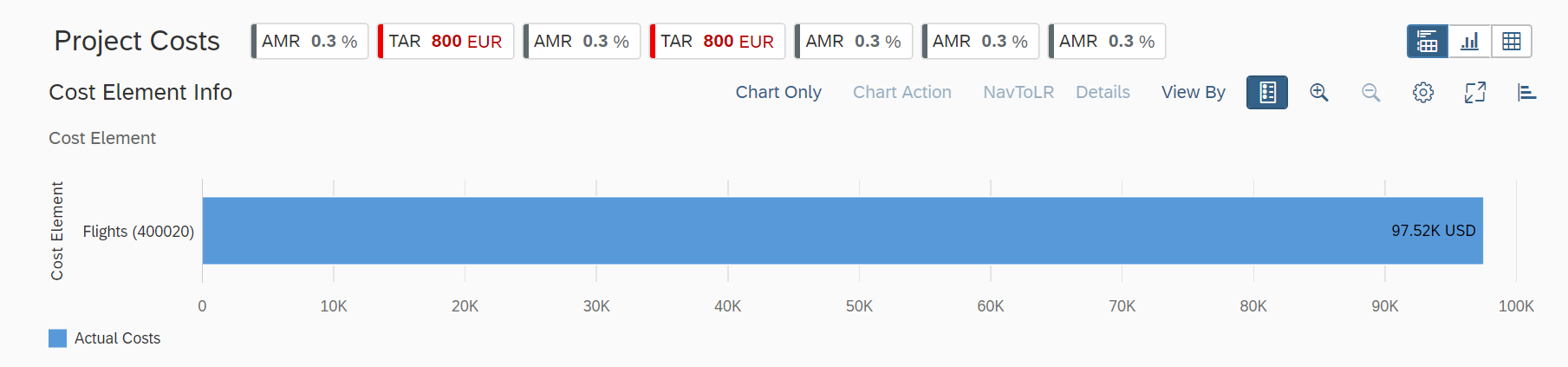
Chart-Only View
Chart-Only View
By selecting the chart context, users can navigate to other applications. A smart chart provides:
- Semantic object-based navigation
- Easy changing of chart types
- Customization of chart settings
The chart-only view provides a way to analyze data from different perspectives, step by step, to investigate a root causeby drilling down without direct access to transactional content. The smart chart control is used to provide the chart visualization.
You use this features to deal with analytical data that can be visually represented using charts, without needing to link them to the transactional data set.
This image is interactive. Hover over each area for a description. Click highlighted areas for more information
Hover over each action for a description. Click the action for more information.
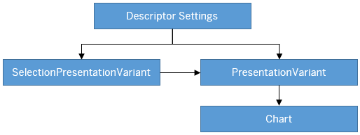
Descriptor Settings: Table-only view
Configuration Sample:
"sap.ui.generic.app":{
   "pages":[
      {
         "entitySet":"SEPMRA_C_ALP_SlsOrdItemCube",
         "component":{
            "name":"sap.suite.ui.generic.template.AnalyticalListPage",
            "list":true,
            "settings":{
                  "qualifier":"DefaultVariant",
                  }
            }
      }
},
Annotation: SelectionPresentationVariant with Qualifier="DefaultVariant"
Configuration Sample:
<Annotation Term="UI.SelectionPresentationVariant" Qualifier="DefaultVariant">
  <Record>
    <PropertyValue Property="Text" String="Product Financial Analysis"/>
    <PropertyValue Property="SelectionVariant" Path="@UI.SelectionVariant#DefaultSelectionVariant"/>
    <PropertyValue Property="PresentationVariant" Path="@UI.PresentationVariant#DefaultPresentationVariant"/>
  </Record>
</Annotation>
Annotation: Presentation Variant
<Annotation Term="UI.PresentationVariant" Qualifier="DefaultPresentationVariant">
  <Record>
    <PropertyValue Property="Text" String="Default"/>
    <PropertyValue Property="SortOrder">
      <Collection>
        <Record Type="Common.SortOrderType">
          <PropertyValue Property="Property" PropertyPath="NetAmount"/>
          <PropertyValue Property="Descending" Bool="true"/>
        </Record>
      </Collection>
    </PropertyValue>
    <PropertyValue Property="Visualizations">
      <Collection>
         <AnnotationPath>@UI.Chart#Default</AnnotationPath>
      </Collection>
   </PropertyValue>
  </Record>
</Annotation>
Use the app-descriptor setting chartPresentationQualifier to
render a chart based on a specific PresentationVariant
annotation
configuration.
"settings": {
"chartPresentationQualifier": “qualifier”}
Annotation: Chart
<Annotation Term="UI.Chart" Qualifier="Default">
  <Record Type="UI.ChartDefinitionType">
    <PropertyValue Property="Title" String="Revenue by Customer"/>
    <PropertyValue Property="Description" String="Net Revenue by Customer"/>
    <PropertyValue Property="ChartType" EnumMember="UI.ChartType/Column"/>
    <PropertyValue Property="Dimensions">
      <Collection>
        <PropertyPath>SoldToParty</PropertyPath>
        <PropertyPath>DeliveryCalendarYear</PropertyPath>
      </Collection>
     </PropertyValue>
     <PropertyValue Property="DimensionAttributes">
       <Collection>
          <Record Type="UI.ChartDimensionAttributeType">
             <PropertyValue Property="Dimension" PropertyPath="SoldToParty"/>
             <PropertyValue Property="Role" EnumMember="UI.ChartDimensionRoleType/Category"/>
          </Record>
          <Record Type="UI.ChartDimensionAttributeType">
             <PropertyValue Property="Dimension" PropertyPath="DeliveryCalendarYear"/>
             <PropertyValue Property="Role" EnumMember="UI.ChartDimensionRoleType/Series"/>
          </Record>
       </Collection>
     </PropertyValue>
     <PropertyValue Property="Measures">
       <Collection>
         <PropertyPath>NetAmount</PropertyPath>
       </Collection>
     </PropertyValue>
     <PropertyValue Property="MeasureAttributes">
       <Collection>
          <Record Type="UI.ChartMeasureAttributeType">
             <PropertyValue Property="Measure" PropertyPath="NetAmount"/>
             <PropertyValue Property="Role" EnumMember="UI.ChartMeasureRoleType/Axis1"/>
             <PropertyValue Property="DataPoint" AnnotationPath="@UI.DataPoint#NetAmount"/>
          </Record>
       </Collection>
     </PropertyValue>
   </Record>
</Annotation>
Semantic Navigation
If you select a data point or segment from a chart, the smart chart checks the annotation of any semantic object definition for these dimensions and uses it as a base to render the navigation links. For example,
Cost Center dimension
<Annotations xmlns=http://docs.oasis-open.org/odata/ns/edm Target=”Emp_Line_Item.Item/Cost_Center”>
	<Annotation Term=”com.sap.vocabularies.Common.v1.SemanticObject” String=”CostCenter”/>
</Annotations>
In the preceding example, the smart charts retrieve all the navigation parameters for which
you have an authorization and that are defined for the CostCenter
semantic object. The selected chart and filter context is passed to the target
application through the navigation context.
Choose Details on the toolbar, to view navigation links that define actions associated with semantic objects.
Chart Operations
You can perform several chart level operations on the toolbar. The Settings option on the chart toolbar enables you to include additional filters on the chart, or to change:
- Dimensions and measures bound to a chart
- Roles for dimensions and measures
- Sort order in charts
Actions by Annotation
Any action that you define in the Actions property of the chart
annotation (DataFieldForAction or
DataFieldForIntentBasedNavigation), is displayed as an
additional button on the chart toolbar (when
determining=false).
To correctly integrate your app extension coding with SAP Fiori elements, use only the extensionAPI of SAP Fiori elements. For more information, see Using the extensionAPI.
Determining Button
You can configure the smart chart toolbar to contain action buttons defined with
annotations com.sap.vocabularies.UI.v1.DataFieldForAction and
com.sap.vocabularies.UI.v1.DataFieldForIntentBasedNavigation.
Choosing DataFieldForAction executes the back-end function import
as identified by the Action property. When you choose
DataFieldForIntentBasedNavigation, the appropriate SAP Fiori
app is launched. The determining buttons for the chart are found in the footer bar
and the chart buttons are ordered before the table
buttons.
<PropertyValue Property="Actions">
   <Collection>
      <Record Type="UI.DataFieldForAction">
         <PropertyValue Property="Label" String="Copy"/>
         <PropertyValue Property="Action" String="CZ_EASILINEITEMS_SADL_CDS.CZ_EASILINEITEMS_SADLType/Copy"/>
         <PropertyValue Property="InvocationGrouping" EnumMember="UI.OperationGroupingType/Isolated"/>
         <PropertyValue Property="Determining" Bool="true"/>

      </Record>
      <Record Type="UI.DataFieldForIntentBasedNavigation">
         <PropertyValue Property="Label" String="Manage Products (STTA)"/>
         <PropertyValue Property="SemanticObject" String="EPMProduct"/>
         <PropertyValue Property="Action" String="manage_st"/>
         <PropertyValue Property="Determining" Bool="true"/>
      </Record>
   </Collection>
</PropertyValue>
With the click of a button, the associated:
-
DataFieldForActionannotation handles the action as defined. The user application has to ensure that this points to the fully qualified action or function. -
DataFieldForIntentBasedNavigationannotation launches the SAP Fiori applications as specified in the action. If the action is configured to accept context, then the selected chart and filter context is passed to the target application through the navigation context.
<PropertyValue Property="Actions">
   <Collection>
      <Record Type="UI.DataFieldForAction">
         <PropertyValue Property="Label" String="Copy"/>
         <PropertyValue Property="Action" String="CZ_EASILINEITEMS_SADL_CDS.CZ_EASILINEITEMS_SADLType/Copy"/>
      </Record>
      <Record Type="UI.DataFieldForIntentBasedNavigation">
         <PropertyValue Property="Label" String="Manage Products (STTA)"/>
         <PropertyValue Property="SemanticObject" String="EPMProduct"/>
         <PropertyValue Property="Action" String="manage_st"/>
      </Record>
   </Collection>
</PropertyValue>
Enabling Data Label in Smart Charts and KPI Cards
You can make data labels visible in smart charts and KPI cards.
To do this, set the showDataLabel property to
True in the manifest settings. The default value is
False.
"pages": [{
            "entitySet": "SEPMRA_C_ALP_SlsOrdItemCubeALPResults",
            "component": {
                "name": "sap.suite.ui.generic.template.AnalyticalListPage",
                "list": true,
                "settings": {
                    "chartSettings": {
                        "showDataLabel": true
                    },