Extension Points for Object Page Header Facets
Extension Points for Object Page Header Facets
Use app extensions with caution and only if you cannot produce the required behavior by other means, such as manifest settings or annotations. To correctly integrate your app extension coding with SAP Fiori elements, use only the extensionAPI of SAP Fiori elements. For more information, see Using the extensionAPI.
After you've created an app extension, its display (for example, control placing, CSS) and system behavior (for example, model and binding usage, busy handling) of the app extension lies within the application's responsibility. SAP Fiori elements provides support only for the official extensionAPI functions. Don't access or manipulate SAP Fiori elements' internal coding.
On the object page, you can use extension points to add additional header facets in the following places:
-
Before header facet: The extension is inserted before a given facet.
-
Replace header facet: The extension is rendered instead of an existing facet.
-
After header facet: The extension is inserted after a given facet.
You must use a view inside the extension to create a header facet extension. Enter the extension information in the following format in the manifest.json of your application:
<Different_Scenario>|<EntitySet_Name>|headerEditable::<Annotation_Information>
Specify the extension facet in the form of its annotation path. In addition, you must specify the entity set name, as the same
annotation may exist for various entity sets. You also need to define the className, viewName, type and the optional parameter
bVisibleOnEdit.
You only set this optional parameter to "false" if the entire header extension is to be hidden when the object page is edited.
"extends": {
   "extensions": {
         "sap.ui.viewExtensions": {
                 "sap.suite.ui.generic.template.ObjectPage.view.Details": {
                           "BeforeHeaderFacet|STTA_C_MP_Product|headerEditable::com.sap.vocabularies.UI.v1.Chart::SpecificationWidthBulletChart": {
                                     "className": "sap.ui.core.mvc.View",
                                     "viewName": "STTA_MP.ext.fragments.HeaderExtensionFacet",
                                     "type": "XML",
                                     "bVisibleOnEdit": true
   }
                        }
           }
     }
}
The following extension options are available:
-
Standard object header facet: Before, replace, and after scenario:
-
"BeforeHeaderFacet|<EntitySet Name>|headerEditable::<Annotation information " -
"ReplaceHeaderFacet|<EntitySet Name>|headerEditable::<Annotation information>" -
"AfterHeaderFacet|<EntitySet Name>|headerEditable::<Annotation information>"
-
-
Simple object header facet: Before, replace, and after scenario:
"BeforeSimpleHeaderFacet|<EntitySet Name>|headerEditable::<Annotation information>""ReplaceSimpleHeaderFacet|<EntitySet Name>|headerEditable::<Annotation information>""AfterSimpleHeaderFacet|<EntitySet Name>|headerEditable::<Annotation information>" Replace the complete object page header with an extension. This means that the
UI.HeaderFacetannotation is not there. If it is there, remove it from the annotations. The manifest entry should look like this:"ReplaceHeaderExtensionFacet|<EntitySet Name>"-
Standard object header: If there is no image in the object page header, you can include an extension instead of an image. The manifest entry should look like this:
"NoImageExtensionFacet|<EntitySet Name>"You can only use this scenario if there is no value for the
ImageUrlorTypeImageUrlproperty of theUI.HeaderInfoannotation.If there is an image in the object page header, you can enter an extension after the image. The manifest entry should look like this:
" AfterImageExtensionFacet|<EntitySet Name>" -
Object page header containing only a
DataPointannotation: Before, replace, and after scenario:-
"BeforeHeaderDataPoint|<EntitySet Name> | <Annotation Information>" -
"ReplaceHeaderDataPoint|<EntitySet Name> | <Annotation Information>" -
"AfterHeaderDataPoint|<EntitySet Name> | <Annotation Information>"
-
Adding Custom Header Facets
You have two options for including custom elements into the header area of an object page:
-
You can include complete header facets next to the existing annotation-based header facets. This option provides flexibility when creating your own XML fragment and the corresponding controller implementation.
-
You can extend an already existing header facet that displays a group of fields with your own custom field.
You can find further details in the sections below.
-
Key user adaptation for object page headers is currently only possible for non-editable header content, that is, if
editableHeaderContent=falseis set in the manifest. -
You can only place 'Custom Header Facets' in the root collection of the header facet definition. You cannot place it in further-nested collection facet definitions.
-
Custom header facets and fields are currently supported only as read-only. To have editable fields for the information provided through custom header facets or fields, you need to extend the "Edit Header Section".
For more information, refer to Adapting the UI: List Report and Object Page.
Using Custom Header Facets
Custom header facets provide the following features:
-
adding free-style headers via an
xmlfragmentdefinition -
positioning relative to existing header elements defined by header facets or other custom headers
-
using a localized header facet title
To define a header facet on UI level - you do this if you want to add a custom look and feel, or to use controls that are not supported by default - you can extend the manifest of the corresponding object page with a content-based configuration or an annotation-based configuration. You define header facets by using a custom key that you later reference by providing the following properties:
-
a title and subtitle (both optional)
-
the UI5 fragment (type and name) and
-
its relative position to an anchor facet
Priority Rules
Settings in the content-based configuration block have a higher priority and therefore overwrite settings in the annotation-based configuration block for identical keys.
Content-Based Configuration
{
"sap.ui5": {
"routing": {
"targets": {
"SalesOrderManageObjectPage": {
"options": {
"settings": {
"content": {
"header": {
"facets": {
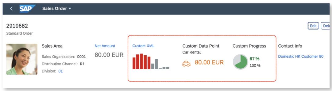
"CustomHeaderFacet1": {
"type": "XMLFragment",
"name": "SalesOrder.custom.CustomHeaderFacetColumnChart",
"stashed": false,
"visible": "{= %{OverallSDProcessStatus} === 'C'}",
"position": {
"placement": "After",
"anchor": "NetValueDataHeader"
},
"flexSettings": {
"designtime": "not-adaptable-visibility"
}
},
"CustomHeaderFacet2": {
"type": "XMLFragment",
"name": "SalesOrder.custom.CustomHeaderFacetDataPoint",
"title": "{i18n>customHeaderFacet2-CustomDataPoint}",
"subTitle": "{i18n>customHeaderFacet2-CarRental}",
"requestGroupId": "LongRunners",
"stashed": false,
"position": {
"placement": "After",
"anchor": "CustomHeaderFacet1"
}
}
}
}
},
"controlConfiguration": {
"@com.sap.vocabularies.UI.v1.HeaderFacets": {
... see below ...
}
}
}
}
}
}
}
}
Annotation-Based Configuration
{
    "sap.ui5": {
        "routing": {
            "targets": {
                "SalesOrderManageObjectPage": {
                    "options": {
                        "settings": {
                            "content": {
                                "header": {
                                   ... see above ...
                                }
                            },
                            "controlConfiguration": {
                                "@com.sap.vocabularies.UI.v1.HeaderFacets": {
                                    "facets": {
                                        "CustomHeaderFacet2": {
                                            "type": "XMLFragment",
                                            "name": "SalesOrder.custom.CustomHeaderFacetOverwritten",
                                            "title": "Custom Error",
                                            "subTitle": "Should never appear!",
                                            "stashed": false,
                                            "position": {
                                                "placement": "After",
                                                "anchor": "CustomHeaderFacet1"
                                            }
                                        },
                                        "CustomHeaderFacet3": {
                                            "type": "XMLFragment",
                                            "name": "SalesOrder.custom.CustomHeaderFacetHarveyBall",
                                            "title": "{i18n>customHeaderFacet2-CustomProgress}",
                                            "stashed": false,
                                            "position": {
                                                "placement": "After",
                                                "anchor": "CustomHeaderFacet2"
                                            }
                                        }
                                    }
                                }
                            }
                        }
                    }
                }
            }
        }
    }
}
In this example, the second header facet with the key CustomHeaderFacet2 occurs twice: once in the content-based
configuration and a second time in the annotation-based configuration. Since the first configuration has a higher priority, the
second entry will be skipped at runtime and you won't see the fragment
SalesOrder.custom.CustomHeaderFacetOverwritten as a header facet.
Settings for Custom Header Facets
You can define your custom header facet by implementing an xmlfragment and using the following properties:
| Property Name | Supported Values | Description |
|---|---|---|
| type | "XMLFragment" | Type of section (only "XMLFragment" is currently available) |
| name | Module Path of "XMLFragment" | Defining the target fragment follows the syntax of defining a fragment via
Fragment.load. |
| title* | Text | Binding Expression | Title of the header facet (usually a binding path to an i18n text). If you do not specify it here, you should
add the title in the xmlfragment. |
| subTitle* | Text | Binding Expression | Subtitle of the header facet (usually a binding path to an i18n text). |
| stashed* | Boolean | Defines if the header facet is stashed in personalization. The default setting is
true. |
| visible* | Boolean | Binding Expression | Defines if the header facet is displayed in the header area. The default setting is
true. |
| position | The properties in this group define the position of the header facet relative to another facet. | |
| position.placement* | "Before" | "After" | Defines the placement: either "Before" or "After" (default) the referenced facet (anchor). |
| position.anchor | Facet Key | The key of another header facet to be used as the placement anchor. Header facets defined via the
Facet annotation can be referenced by its FacetKey. |
| requestGroupId |
"Heroes" | "Decoration" | "Workers" | "LongRunners" |
Enables the grouping of back-end requests retrieving the header facet data in different $batch groups according to their loading time. You should separate long runners from fast runners to optimize the overall user experience. For more information, refer to Defining the Loading Behavior of Object Page Headers. |
| flexSettings | Defines the key user adaptation behavior of the header facet. | |
| flexSettings.designtime |
"Default" | "not-adaptable-visibility" | "not-adaptable" | " not-adaptable-tree" | "not-adaptable-visibility" | "not-removable" |
Defines which settings are available for key user adaptation at design time. For example, the value "not-adaptable-visibility" means that all actions that influence the visibility are disabled. Remove and make visible are not possible, whereas moving the header facet is enabled. |
* = optional
Using a Custom Header Facet to Display a Harvey Ball Micro Chart
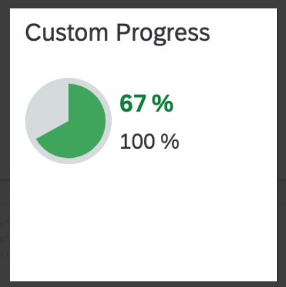
The values are retrieved via value binding and the title is defined in the manifest.json.
Custom Header Using a Harvey Ball Micro Chart
<core:FragmentDefinition xmlns="sap.m" xmlns:core="sap.ui.core" xmlns:mc="sap.suite.ui.microchart">
<VBox id="CustomHeaderFacetHarveyBall" displayInline="true">
<mc:HarveyBallMicroChart size="S" total="100" totalScale="%" press="press">
<mc:items>
<mc:HarveyBallMicroChartItem
fraction="{= ((100 > 0) ? ((${Progress} > 100) ? 100 : ((${Progress} < 0) ? 0 : (${Progress} / 100 * 100))) : 0) }"
color="Good"
fractionScale="%"
/>
</mc:items>
</mc:HarveyBallMicroChart>
</VBox>
</core:FragmentDefinition>Using Custom Header Fields
Custom header fields provide the following features:
-
adding free-style headers via an
xmlfragmentdefinition -
positioning relative to existing fields on a field group or other custom fields
-
using a localized header facet title
Using Custom Header Fields
To define a field in a header field - you do this if you want to add a custom look and feel, or to use controls that are not supported by default - you can extend the manifest of the corresponding object page with an annotation-based configuration. You define custom header fields by using a custom key that you later reference by providing the following properties:
-
a label (optional)
-
the UI5 fragment (template) and
-
its relative position to an anchor facet
Annotation-Based Configuration
{
   "sap.ui5": {
      "routing": {
         "targets": {
            "LineItemsObjectPage": {
               "options": {
                  "settings": {
                     "controlConfiguration": {
                        "@com.sap.vocabularies.UI.v1.FieldGroup#ObjectPageHeaderData": {
                           "fields": {
                              "CustomField1": {
                                 "label": "{i18n>ObjectPageHeaderFacetFieldLabel1}",
                                 "template": "ManageItems.custom.CustomHeaderFacetFieldGroupForm",
                                 "position": {
                                    "placement": "Before",
                                    "anchor": "DataField::headerDate"
                                 }
                              }
                           }
                        }
                     }
                  }
               }
            }
         }
      }
   }
}
You reference the fieldGroup through the annotation path with the corresponding qualifier:
"@com.sap.vocabularies.UI.v1.FieldGroup#ObjectPageHeaderData". The qualifier can be found in the annotation
as shown below:
Metadata Annotation
<Schema>
    <Annotations Target="<PageName>">
        <Annotation Term="UI.FieldGroup" Qualifier="ObjectPageHeaderData">
            ... records
        </Annotation>
    </Annotations>
</Schema>
Settings for Custom Header Fields
You can define your custom header fields by implementing an xmlfragment and using the following properties:
| Property Name | Supported Values | Description |
|---|---|---|
| key | Module Path of "XMLFragment" | Defining the target fragment follows the syntax of defining a fragment via
Fragment.load. |
| label* | Text | Binding Expression | Label of the field (usually a binding path to an i18n text). If you do not specify it here, you should add a
label in the xmlfragment. |
| template | Module Path of "XMLFragment" | Defining the target fragment follows the syntax of defining a fragment via
Fragment.load. |
| position | The properties in this group define the position of the header facet relative to another facet. | |
| position.placement* | "Before" | "After" | Defines the placement: either "Before" or "After" (default) the referenced facet (anchor). |
| position.anchor | Facet Key | The key of another header field to be used as the placement anchor. Header fields defined via the field group, including a property annotation, can be referenced by the corresponding property name. |
* = optional
Finding the Right Key for the Anchor
For the correct positioning of your custom elements, you need to identify an anchor element. For more information, see Finding the Right Key for the Anchor.