Step 7: Header Container and Radial Micro Chart
Step 7: Header Container and Radial Micro Chart
In the last steps, we have implemented the user interaction handling to allow navigation
from the Production Process tile to the
ProcessFlow view. With the Production Process
tile, we only have an aggregated view of the progress of the production process.
Therefore, we want to provide a detailed overview of the current production status in
this step. We will add the production flow, the states of the manufacturing steps, their
dependencies, and critical steps if necessary.
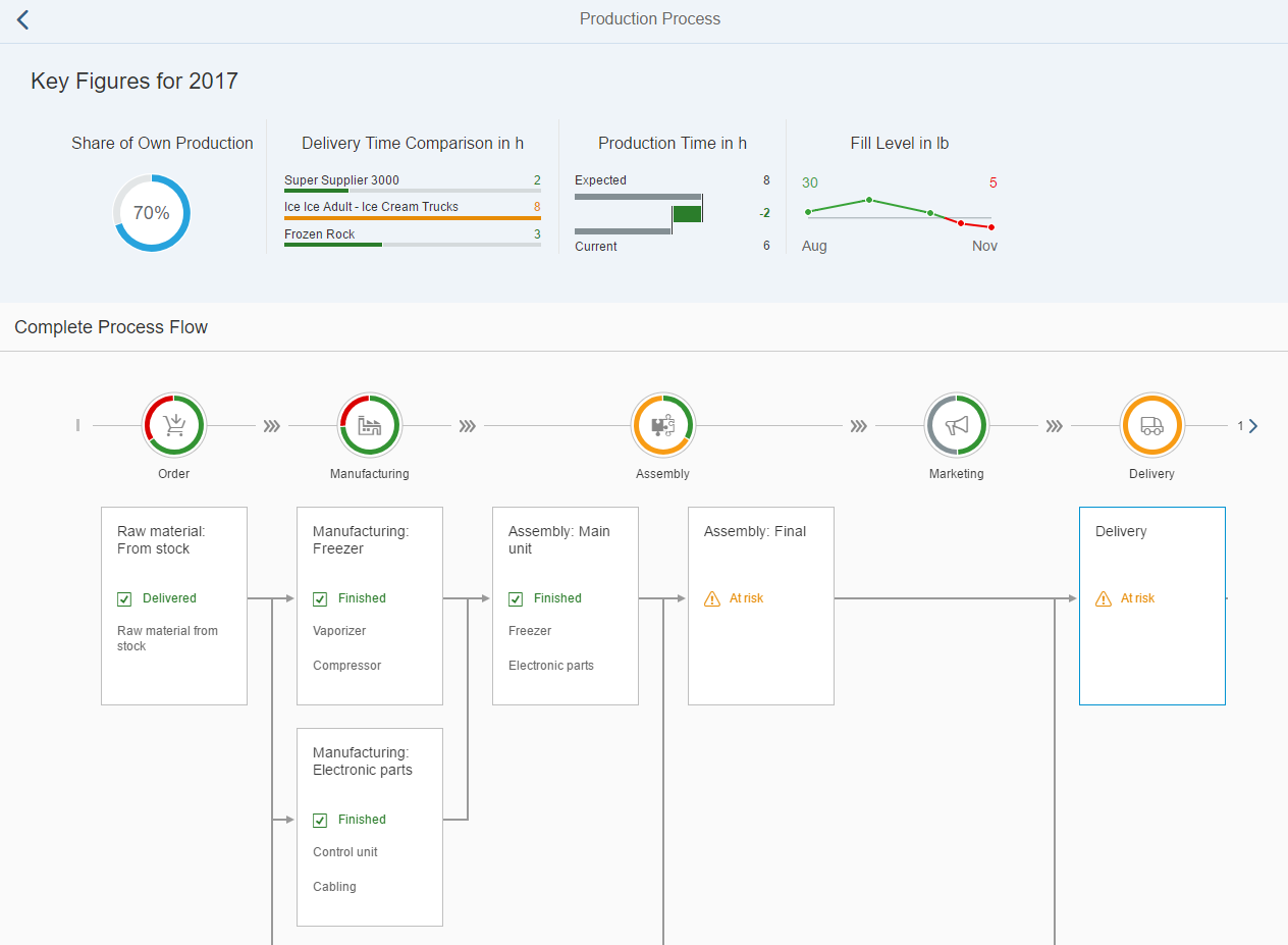
First, we add the ProcessFlow control to this view, so that we see the
current status of the production process. The production process consists of six steps
represented by the following ProcessFlowLaneHeaders:
-
Order
-
Manufacturing
-
Assembly
-
Marketing
-
Delivery
-
Payment
The ProcessFlowLaneHeaders use icons that stand for the meaning of the
lanes. The lane headers aggregate the status of the nodes that are assigned to a
particular lane. Each lane consists of ProcessFlowNodes that describe
an activity in this production step. The structure of the nodes and their relationships
for ProcessFlow are defined in the
ProcessFlowData.json file.
The header area of the ProcessFlow should contain a
HeaderContainer with four micro charts that provide the following
information:
-
Share of Own Production (your own production rate)
-
Delivery Time Comparison in h (comparison of suppliers' delivery time)
-
Production Time in h (comparison of expected and current production times)
-
Fill Level in lb (displays the fill level changes over time)
Preview of the final ProcessFlow
This is the final view of this page:
Preview of this step
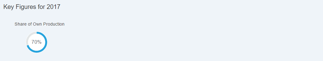
HeaderContainer with RadialMicroChart
In the header area, we can display additional values for the business logic of the production process. We can use charts to visualize the information. To distinguish this part from the ProcessFlow, we use the ObjectHeader in the header area. We want to add further charts in the following steps and therefore, we create an instance of the HeaderContainer that contains our charts.
The first chart contains the share of the parts being produced by
us that should be included in the final product. This value is already available in
the data model. You can visualize the percentage value by using a
RadialMicroChart. We first create a
HeaderContainer with a single
RadialMicroChart.
ProcessFlow.view.xml
You can view and download this step in the Demo Kit at Ice Cream Machine - Step 7 - Header Container and Radial Micro Chart.
<mvc:View
	xmlns:mvc="sap.ui.core.mvc"
	xmlns="sap.suite.ui.commons"
	xmlns:m="sap.m"
	xmlns:mc="sap.suite.ui.microchart"
	controllerName="sap.suite.ui.commons.demokit.tutorial.icecream.07.controller.ProcessFlow">
	<m:Page
		title="{i18n>processFlowTitle}"
		showNavButton="true"
		navButtonPress=".onNavButtonPressed"
		backgroundDesign="Solid">
		<m:content>
			<m:ObjectHeader
				responsive="true"
				title="{
					parts: [
						'i18n>processFlowChartsTitle',
						'business>/year'
					],
					formatter: '.formatMessage'
				}">
				<m:headerContainer>
					<m:HeaderContainer
						scrollStep="200"
						scrollTime="500"
						showDividers="true"
						class="sapUiSmallMargin">
						<m:FlexBox
							width="12rem"
							height="10rem"
							alignItems="Center"
							justifyContent="Center"
							direction="Column">
							<m:Title
								text="{i18n>processFlowChartsShareOwnProduction}"
								class="sapUiSmallMargin"/>
							<m:FlexBox width="6rem" height="6rem">
								<mc:RadialMicroChart percentage="{business>/shareOwnProduction}"/>
							</m:FlexBox>
						</m:FlexBox>
					</m:HeaderContainer>
				</m:headerContainer>
			</m:ObjectHeader>
		</m:content>
	</m:Page>
</mvc:View>
The HeaderContainer has scrollStep and
scrollTime properties that will be used to change the
scroll step and the animation speed of the HeaderContainer. We keep
the showDividers default value as we want to split each chart
in the HeaderContainer.
The FlexBox is used
as a container for the Title and the inner
FlexBox for the RadialMicroChart and
this leads to the correct sizing. To visualize the share of your own production, the
value should be set in the percentage property of the
RadialMicroChart. With the Size
enumeration, you can use the chart in one of the fixed sizes. If not set, the
default Responsive size is used and the width and height will
adapt to the surrounding container. We set the width and
height of the FlexBox
instance.
ProcessFlow.controller.js
sap.ui.define([
	"sap/ui/core/mvc/Controller",
	"sap/base/strings/formatMessage"
], function (Controller, formatMessage) {
	"use strict";

	return Controller.extend("sap.suite.ui.commons.demokit.tutorial.icecream.07.controller.ProcessFlow", {
		formatMessage: formatMessage,

		onNavButtonPressed: function () {
			this.getOwnerComponent().getRouter().navTo("home");
		}
	});
});
When the user clicks on the Back button, onNavButtonPressed is called and this triggers the navigation back to the start page view.
Parent topic: Ice Cream Machine
Previous: Step 6: Chart Container