Screen Reader Support
Screen Reader Support
General Recommendations
The following rules and guidelines will help you avoid common pitfalls and show you best practices. You still need to be aware that there may be deviations between the interpretation of the markup by the different screen readers.
Generate valid HTML
The screen reader software gets the information about the page directly from the DOM. Therefore, if the DOM is invalid, the information presented to the user might be invalid as well. Ideally, if the DOM is correct, the screen reader software will interpret it correctly. When you need to create new controls or change the HTML structure of existing ones for some reason, you have to check the validity of the resulting HTML.
Use titles for complex components
Complex controls like pages, panels, and tables need a title to summarize the
contents they hold. If you use the standalone Title control,
make sure that it is associated with the element that needs the title.
<mvc:View
xmlns:mvc="sap.ui.core.mvc"
xmlns="sap.m">
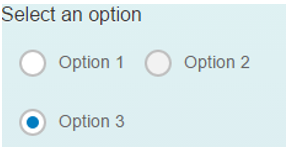
<Title id="rbGroupTitle" text="Select an option" textAlign="Center"/>
<RadioButtonGroup columns="2" selectedIndex="2" ariaLabelledBy="rbGroupTitle">
<buttons>
<RadioButton id="RB2-1" text="Option 1"/>
<RadioButton id="RB2-2" text="Option 2" editable="false"/>
<RadioButton id="RB2-3" text="Option 3"/>
</buttons>
</RadioButtonGroup>
</mvc:View>
Result:
Use labels
Make sure that all edit boxes, search fields, and column headers have labels. If
not, use the Label control and add one. Labels have to be
connected to each control, for example by using one of the following:
-
labelFor=”…” -
aria-label=”…” -
aria-labelledby=”…” -
placeholder=”…” -
title=”…”
APIs in the controls
Use the specific roles and attributes, based on ARIA 1.1 specifications:
-
ariaDetailsassociation, which sets thearia-detailsattribute for thesap.m.Imagecontrol. It’s used for referencing an element that provides a more detailed information than what is normally provided by thearia-describedby. -
ariaHasPopupproperty which sets thearia-haspopupattribute forsap.m.Buttonandsap.m.Toolbar(when active). It’s used for indicating the availability and type of interactive popup element, such as menu or dialog that can be triggered by the control.
Titles in headings
For headings (table toolbar, page header, form toolbar, panel toolbar) the text
should be in a sap.m.Title control (make sure that it is
associated with the element that needs the title and, if not, add the reference
using aria-labelledby).
<mvc:View
      xmlns:mvc="sap.ui.core.mvc"
      xmlns="sap.m">
   <Panel expandable="true">
      <headerToolbar>
         <Toolbar height="3rem">
            <Title text="Header"/>

            <ToolbarSpacer/>
            <Button icon="sap-icon://settings"/>
            <Button icon="sap-icon://drop-down-list"/>
         </Toolbar>
      </headerToolbar>
      <content>
         <Text text="Lorem ipsum"/>
      </content>
   </Panel>
</mvc:View>
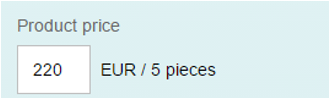
Labels and descriptions for input controls
When using the Input control, always provide a label (make sure
it is connected with the input). You can also use the
description property to add additional information. For the
input, the description is usually used for showing the unit of measurement (for
example. "EUR").
<mvc:View
   xmlns:l="sap.ui.layout"
   xmlns:mvc="sap.ui.core.mvc"
   xmlns="sap.m">
   <l:VerticalLayout
      class="sapUiContentPadding"
      width="100%">
      <l:content>
         <Label text="Product price" labelFor="productPriceInput"/>
         <Input
            id="productPriceInput"
            value="220"
            description="EUR / 5 pieces"
            width="200px"
            fieldWidth="60px" />
      </l:content>
   </l:VerticalLayout>
</mvc:View>
Result:
Empty labels in drop-down lists
In some cases, you may need to provide an empty option in a drop-down field such
as Select. This way you want to indicate that none of the items
in the drop-down is applicable, or offer the empty option as a way to clear the
selection. In this case, you should properly label the empty option with
(None) and not leave it blank.
The labeling on the empty option will be read by the screen reader and the end user will be correctly informed about the semantics of the empty option.
The empty label (None) should always be the first item in the drop-down.
List with info toolbar
When using the List control with visible non-active info toolbar
with plain text content, you need to associate the
aria-labelledby of the list with the text content of the
infoToolbar aggregation.
...
<List ariaLabelledBy="textInInfoToolbarId">
                <infoToolbar>
                               <OverflowToolbar active="false">
                                               <Label id="textInInfoToolbarId" text="Announce this text when the first list item is focused" />
                               </OverflowToolbar>
                </infoToolbar>
                <items>
			  ...
</List>
...
Provide additional information when there are changes in the screen
Make sure to provide additional information to the user, when changes in the screen are done, based on user interaction. You can use one of the following informative techniques:
-
Include additional text description via
ariaDescribedBy/ariaLabelledByAPI for the control triggering the update (Button, Search Field, or other interactive control). For example: When search results will be placed in the area below, you can add a text describing how/where the users can locate the results. -
Include additional text description via
ariaDescribedBy/ariaLabelledByon the parent control level. For example: In the case of apps using the master-detail pattern, where the list is on the left side and results are presented on the right side, you should add additional text describing that upon selection in the list, the details will be loaded in the details panel. -
When something is opening on the screen, you can move the focus there, if your use case requires it. For example, for apps using the master-detail pattern when the user needs to browse the available items, the focus should stay in the master list area. And in cases when the user has selected an item from the master list and needs to perform an action, the focus should move to the details area.
For controls that are toggling/opening regions and are still present after the toggling, then the focus should remain on them. But if the control is hidden afterwards – the focus needs to be moved, into the default focus position in the toggled/opened region.
Tips for Testing
Start a screen reader, start the application, walk through the application using the keyboard and listen. For example, you can also use Virtual Cursor mode or similar functions of your screen reader because some elements do not need to have the focus to be readable by screen readers.
-
Is everything that you need to use the application read correctly?
-
Each element’s role, name, state, label, tooltip, further information (attached errors, usage hints)?
-
Is this the case for interactive and semantic/non-semantic elements?
-
Actively check that all visible UI elements are read.
-
-
Is it read correctly?
-
No duplicates?
-
No strange pronunciation, like reading English with German words or vice versa?
-
No nonsense, wrong values, another element’s attributes?
-
-
Are screen updates like application messages, dialogs (popups), and similar dynamic content read correctly and at the right time?