What's New in SAPUI5 1.72

What's New in SAPUI5 1.72

With this release SAPUI5 is upgraded from version 1.71 to 1.72.

New Features

New Theme Available for SAP Fiori 3 User Experience (Experimental)

To further support the SAP Fiori 3 user experience, a new theme has been introduced: SAP Quartz Dark (theme ID: sap_fiori_3_dark). The theme is provided as an additional theme in SAPUI5.

Note

This theme will have the status 'experimental' until testing is complete.

Responsive Paddings Enablement

We have introduced the sap.ui.core.util.ResponsivePaddingsEnablement utility for applying responsive paddings over separate parts of the controls, when using the SAP Quartz themes. The breakpoints and layout paddings can now be determined by the container's width, and not by the screen size. We have introduced responsive paddings to the sap.m.Page,sap.m.Popover, and sap.m.Wizard controls.

For more information, see Enabling Responsive Paddings According to the Control Width.

New Controls

sap.f.ProductSwitch (Experimental)

The new layout control is a single-level navigation menu that offers access to the entry pages of products. Its items can be configured with an image/icon, title, subtitle, and navigation target.

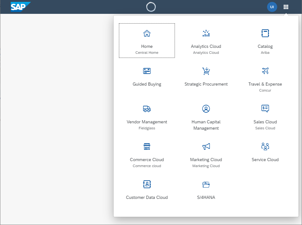
For more information, see the API Reference and the Samples.

Improved Features

Navigation in Nested Components

The navigation in nested components has been enhanced with additional information that can now be passed in optional parameters of the navTo method of sap.ui.core.routing.Router. This additional information enables the routers in nested components to show the targets which are configured to one specific route.

For more information, see sap.ui.core.routing.Router.navTo in the API Reference and Navigate with Nested Components.

SAPUI5 OData V4 Model

The new version of the SAPUI5 OData V4 model introduces the following features:

  • Server-driven paging is now supported unless the server-driven paging takes place in a collection requested with $expand.

  • The resetChanges method on bindings returns a promise which is resolved without a defined result as soon as all changes in the binding itself and all dependent bindings are canceled.

Restriction

Due to the limited feature scope of this version of the SAPUI5 OData V4 model, check that all required features are in place before developing freestyle and SAP Fiori elements applications. Double-check the detailed documentation of the features, as certain parts of a feature may be missing. While we aim to be compatible with existing controls, some controls might not work due to small incompatibilities compared to sap.ui.model.odata.(v2.)ODataModel, or due to missing features in the model (such as tree binding). This also applies to smart controls (sap.ui.comp library) that do not support the SAPUI5 OData V4 model, as well as controls such as TreeTable and AnalyticalTable, which are not supported in combination with the SAPUI5 OData V4 model. The interface for applications has been changed for easier and more efficient use of the model. For a summary of these changes, see Changes Compared to OData V2 Model.

For more information, see OData V4 Model, the API Reference, and the Samples.

Title Alignment Changes for SAP Quartz Themes

A new title alignment has been introduced for the SAP Quartz themes. The title of the affected control is aligned to the start position (left or right depending on the text directionality).

Affected Controls:

  • sap.m.BusyDialog
  • sap.m.Dialog
  • sap.m.MessageBox
  • sap.m.Page
  • sap.m.Popover
  • sap.m.ResponsivePopover
  • sap.m.SelectDialog
  • sap.m.TableSelectDialog
  • sap.m.ViewSettingsDialog

Improved Controls

sap.f.Avatar

We have added more options in the sap.f.AvatarColor enum for the background color of the sap.f.Avatar: Transparent, TileIcon, and Placeholder. To set them, use the backgroundColor property. For more information, see the Sample.

sap.f.FlexibleColumnLayoutSemanticHelper

Some methods in the helper class rely on the internal sap.f.FlexibleColumnLayout reference to be rendered. To facilitate their use, we have implemented two new public methods: whenDOMReady and isDOMReady. Additionally, two more abstract methods were implemented that internally wrap isDOMReady and whenDOMReady, which provide means for other similar methods to be combined, if necessary. For more information, see the API Reference.

sap.m.ActionSheet

We have extended the afterClose event, to provide context information that indicates the trigger of closing the control - whether it closes with a selection, or it is dismissed. For more information, see the API Reference.

sap.m.ComboBox, sap.m.MultiComboBox, sap.m.Input, sap.m.MultiInput

We have improved the controls to display the text set in the valueStateText property on multiple lines. This ensures that the value state text is displayed even when it is longer than the width of the control's container. For more information, see the sap.m.ComboBox Sample.

sap.m.DateRangeSelection

We have introduced an optional footer with OK and Cancel buttons, to provide an alternative way for users to confirm the date range selection. For more information, see the API Reference.

sap.m.List, sap.m.Table, sap.m.Tree

  • A new parameter for the direction of the swipe event is now available for both left-to-right (LTR) and right-to-left (RTL) scenarios. This parameter can be used in an app for approvals, for example, where a manager wants to accept or reject leave requests using the swipe function on a mobile device or touch screen. For more information, see the API Reference for SwipeDirection, the API Reference for swipe, and the Sample.

  • A new navigated property is now available: After a user has displayed the details of an item, a navigation indicator at the end of the corresponding row indicates that the user has already viewed the details. For more information, see the API Reference, the Sample for lists, and the Sample for tables.

sap.m.SinglePlanningCalendar

The appointmentSelect event was also provided for the appointments in the Month view, fired when an appointment is selected. For more information, see the API Reference.

sap.m.Table

If applications configure a responsive table that contains only one column in such a way that all columns are moved to the pop-in or hidden on smaller screens, this setting is now ignored to ensure that there is at least one column visible in the tabular layout. For more information, see the API Reference.

sap.m.ViewSettingsDialog

The Reset button is now fully available for all the tabs in this control.

  • For built-in tabs (Sort, Group, and Filter), the initial state of the Sort and Group settings is stored upon first opening. If changed, this state can be restored later using the Reset button and Filter tab selection is removed. If no changes have been made, the Reset button remains inactive.
  • For custom tabs (or custom and built-in tabs together), developers can use the Reset event. The Reset button is in an active state, no matter if changes are made or not.

For more information, see the API Reference.

sap.m.Wizard

We have added a new backgroundDesign property. It can change the background color of the content and accepts values from sap.m.PageBackgroundDesign. For more information, see the Sample.

sap.ui.comp.smarttable.SmartTable

We have introduced new key combinations that you can use for opening the table personalization settings and for opening the Export As dialog for the spreadsheet export. For more information, see the FAQ under Smart Table and the Sample.

sap.ui.integration.widgets.Card

  • The predefined parameter LOCALE is now available, and developers can use it in data-request URL queries.
  • New manifestReady event has been introduced in an experimental state. It is fired after the manifest is loaded.
  • The Refresh method is now available in experimental state when consuming sap.ui.integration.widgets.Card as custom HTML element.

For more information, see Card Explorer.

sap.ui.table.AnalyticalTable, sap.ui.table.Table, sap.ui.table.TreeTable

  • You can now select rows using key combinations (select one row: SHIFT SPACE , select multiple rows: SHIFT UP and SHIFT DOWN ). For more information, see the Sample.

  • A new navigated property is now available for rows with row actions: After a user has displayed the details of an item, a navigation indicator at the end of the corresponding row indicates that the user has already viewed the details. For more information, see the API Reference and the Sample.

sap.ui.unified.FileUploader

The new fileEmpty event was introduced, fired when uploading an empty file. For more information, see the API Reference.

sap.uxap.BlockBase

You can now subscribe to the new viewInit event that is fired when the asynchronously created internal view is available. For more information, see the API Reference.

SAP Fiori Elements

General Features

SAP Fiori elements now provides keyboard shortcuts for basic operations. For more information, see Keyboard Shortcuts.

List Report and Object Page

The object page has the following new features:
  • Messages in the message popover are now grouped according to the respective sections.

  • When creating and saving non-draft records, users stay on the object page by default. To allow users to navigate directly back to the list report, you can set the navToListOnSave flag to true in the manifest.json. For more information, see Save and Navigation Options on the Object Page.

  • When a user navigates to the object page in display mode, the focus is now on the first emphasized action button. In create mode, the focus is now on the first editable element.

Analytical List Page

Edm.String and sap:semantics="yearmonth" as well as Edm.String and sap:semantics="year" are now supported in the visual filter in date-based, single selection fields in the Universal Time Coordinated (UTC) format. For more information, see Visual Filter Setup.